The Overwhelm Recovery ProtocolWellness & Routines · ~5 min
About this template · Updated September 2026
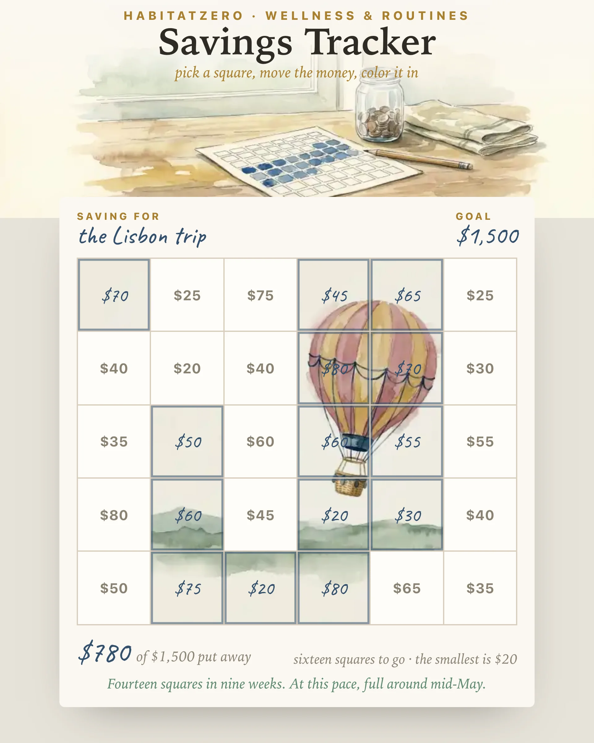
A savings chart is the plainest money tool there is: a sheet of squares, each printed with an amount, and a pen. Every time you move some money into savings you pick the square that matches and color it in. When the sheet is full, the goal is funded. Pinterest is full of these, mostly as printables, and the reason they keep getting pinned is that they work on a tired Tuesday in a way a spreadsheet does not. This page is that chart, drawn live, with two things paper cannot do.
Most savings advice assumes a fixed weekly deposit, and most weeks refuse to cooperate. A car bill lands, a birthday comes round, the hours get cut. A chart of identical squares turns every one of those weeks into a miss.
Here the squares run from small to large. For a goal of one thousand in thirty squares they span roughly ten to fifty-five, and every layout adds up to the goal exactly, whatever number you choose. On a thin week you color the smallest square left. On a good week you take a big one. The chart never asks for the same amount twice, so it has no streak to break; your only job is to keep the ink moving.
Write what the money is for and the goal amount, then choose twenty, thirty or forty-eight squares. The chart lays itself out. When you put money aside, tap the square that matches and it fills in your handwriting; a running sum under the chart tells you what is in, what is left, and which open square is the smallest.
Two things happen that a printable cannot manage. The first is quiet: there is a watercolor painted underneath the squares, and each filled one uncovers its patch of it. Early on you see fragments. Somewhere past halfway the shape becomes obvious, and the last few squares are the ones you will fill just to see it whole. The second is arithmetic. Every fill is dated, so once you have colored squares on two different days the chart works out your pace and says when it expects to be full. It is a guess, and it moves as you do, which is the point: a slow month shows up as a later date, not as a lecture.
Tapping a filled square by mistake will not undo it; the square asks first. Once the chart has ink on it, the goal and the number of squares lock, so the amounts you have already claimed stay honest. Start over is there if you genuinely want a fresh sheet.
The strongest evidence behind a chart like this is not about money at all. A meta-analysis of 138 experiments on goal progress found that prompting people to monitor their progress reliably raised the odds of reaching the goal, and that the effect was larger when progress was physically recorded or reported to someone rather than kept in the head. Coloring a square is exactly that: a record you can see from across the room.
Naming the goal matters too. In field experiments with low-income households, Soman and Cheema found that earmarking savings for a stated purpose increased the amount saved, and that splitting the money into two envelopes rather than one raised it further, because opening a second envelope forces a second decision. The line at the top of this chart is that label, and the squares are the partitions.
Finally, a set of bank experiments across three countries showed that reminders which mentioned the saver's specific goal increased deposits where generic reminders did less. Keep this chart somewhere you will see it; the name at the top does the reminding.
None of this says a chart replaces a budget or an automatic transfer. Set the transfer up if you can. The chart is for the money on top of it, and for the weeks when the transfer is the first thing to go.
Use this chart for one goal with a number and a reason: the emergency fund, the trip, the deposit. If the number is still fuzzy, sharpen it first with the SMART Goals Worksheet and come back with a figure. If what you are counting rises steadily in one measure, pages or kilometers rather than deposits of different sizes, the thermometer on the Goal Tracker will suit it better. And if the savings are one front of a bigger campaign, moving city or starting something, sketch the whole thing on the Goal Map and hang this chart off the money milestone.
Then put it where you will pass it. The chart only works while you can see it.
Every square carries an amount, and together they equal your goal. Each time you move money into savings you color in the matching square, so the sheet fills as the account does and a glance tells you how far there is to go.
That is what the mixed sizes are for. The squares run from small to large, so a lean week can claim the smallest one still open and a good week can take a big one. Nothing on the chart depends on a fixed deposit.
Yes. Print the page and the chart comes out with its amounts and any squares you have already colored, with the controls left off the paper. Many people keep the printout on the fridge and the live version on their phone.
A thermometer shows one level rising and suits progress that arrives in a steady stream. A chart of squares suits deposits of different sizes, because each square is a separate small promise you either keep or leave open.
The public page shows a filled example to explore. Personalizing it in HabitatZero, which is free, gives you your own chart with the goal, the squares you have colored and their dates kept between visits.
By the team behind Fabulous, the science-based self-care app used by over 30 million people.